Unpause life

Unpause life

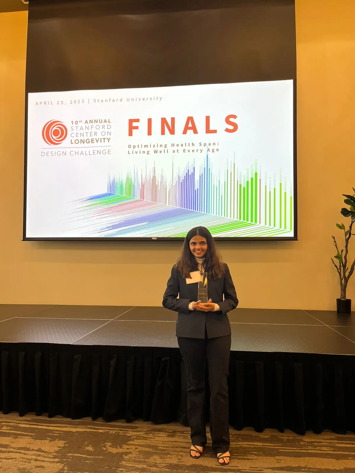
After placing 2nd at Stanford's Longevity Design Challenge, I built this menopause tracking app end-to-end; from research to live product. Tracks symptoms, identifies patterns, and creates summaries women can bring to their doctors.

Role & stack

Solo; Research, Design, Build

on Figma, Claude Code, Next.js, Vercel

Timeline

2022–2023 (concept)

April 2026 (live product)

Role & stack

Solo; Research, Design, Build

on Figma, Claude Code, Next.js, Vercel

Timeline

2022–2023 (concept)

April 2026 (live product)

Home

/

Works

/

Unpause Life


For two years, Unpause Life was a Stanford trophy on my desk and a Figma file I never opened. In April 2026, I opened Claude and shipped the app in one night. This is what happened, and what building it taught me that designing it couldn't.

For two years, Unpause Life was a Stanford trophy on my desk and a Figma file I never opened. In April 2026, I opened Claude and shipped the app in one night. This is what happened, and what building it taught me that designing it couldn't.

Why menopause?

65 million Indian women are navigating menopause right now, mostly without support.

Half don't know what's happening to them. The other half know something is happening and can't name it. Awareness is low, healthcare costs are climbing, and the cultural norm is to wait it out in silence.


For the 2023 Stanford Center on Longevity Design Challenge, I spent five months on this. Interviewed 38 women aged 42–55 across India. Interviewed 8 gynaecologists. The pattern that kept surfacing wasn't medical - it was informational. Women weren't struggling because menopause is inherently unmanageable. They were struggling because nobody had told them what to expect, what was normal, what wasn't, and when to actually see a doctor.


Of the 38 women I spoke to, only 4 were post-menopause. 23 were perimenopausal.

3 had no symptoms yet. Most of the women with symptoms didn't know their symptoms were menopause-related. Many believed heavy bleeding would just resolve on its own.


The 8 gynaecologists confirmed the other side of the gap: patients came in with fragmented information, if any. Nobody had visibility into what happened between appointments.


The problem wasn't medicine. It was translation.

The 2023 kit

I built Unpause as a physical + conversational product. Not an app, not a website - a kit you could open on your kitchen table.

Three layers:

A zine with real menopause stories from Indian women. The idea was empathy before information. Before I told anyone what to do about menopause, I wanted them to feel like someone had actually been through this and lived to talk about it.


A card deck: Menopedia - covering symptoms, risks, post-menopause care, and mental health. Cards, not a pamphlet, because pamphlets get thrown away and cards get sorted, kept, passed around.


A 30-day symptom tracker designed like a fridge calendar. Track your mood, symptoms, and intensity daily. Familiar format, low friction, visible to the user every time they walked past it.


Jaya: a WhatsApp AI assistant. Ask a question, get an answer, get referred to a gynaecologist within 3km. On WhatsApp because that's where Indian women already are. No app to download, no signup, no learning curve.


The positioning was "your wiser older sister, the one you never had." Not a doctor. Not a wellness brand. Someone who's been through it and won't sugarcoat it.


Tested with 25 women. Average rating 4.5/5. They cried. In a good way.

2nd Prize at Stanford Center on Longevity Design Challenge 2023.

The 2023 kit

I built Unpause as a physical + conversational product. Not an app, not a website - a kit you could open on your kitchen table.

Three layers:

A zine with real menopause stories from Indian women. The idea was empathy before information. Before I told anyone what to do about menopause, I wanted them to feel like someone had actually been through this and lived to talk about it.


A card deck: Menopedia - covering symptoms, risks, post-menopause care, and mental health. Cards, not a pamphlet, because pamphlets get thrown away and cards get sorted, kept, passed around.


A 30-day symptom tracker designed like a fridge calendar. Track your mood, symptoms, and intensity daily. Familiar format, low friction, visible to the user every time they walked past it.


Jaya: a WhatsApp AI assistant. Ask a question, get an answer, get referred to a gynaecologist within 3km. On WhatsApp because that's where Indian women already are. No app to download, no signup, no learning curve.


The positioning was "your wiser older sister, the one you never had." Not a doctor. Not a wellness brand. Someone who's been through it and won't sugarcoat it.


Tested with 25 women. Average rating 4.5/5. They cried. In a good way.

2nd Prize at Stanford Center on Longevity Design Challenge 2023.

The two years I did nothing

I flew back to Mumbai. Put the trophy on my desk. Went back to my design job. For two years, the product lived in a Figma file. My excuse was: I need a technical co-founder first. Hours I spent looking for one: zero.


I'm being direct about this because it's the actual story. The barrier to shipping wasn't design. It wasn't research. It wasn't validation. All of that was done. The barrier was a story I was telling myself about who was allowed to build.
The night I stopped waiting

In April 2026, I opened Claude and just talked. The research. The pain points. The kit. The business model. What I wanted the app to feel like.

Claude pointed out something I'd missed for two years: the physical kit wasn't separate from the app - it was the onboarding. By the time a woman downloads the app, she's already tracked symptoms on her fridge for 30 days.


The cold-start problem every consumer wellness app faces? Solved by cardboard.


Then I said: okay, let's build.

Using Claude Code, I shipped six screens overnight:

Onboarding — Name, stage, symptom chips. Personalises the entire app. The welcome screen reads "Welcome home, finally." I teared up writing that line.


Dashboard - Daily check-in, streak tracker, weekly symptom dots, AI-generated insights, education library, community preview.

Daily check-in - Mood, symptoms, intensity, notes. Designed to take 30 seconds, half-asleep, at 6am — which is statistically when menopause is most annoying.

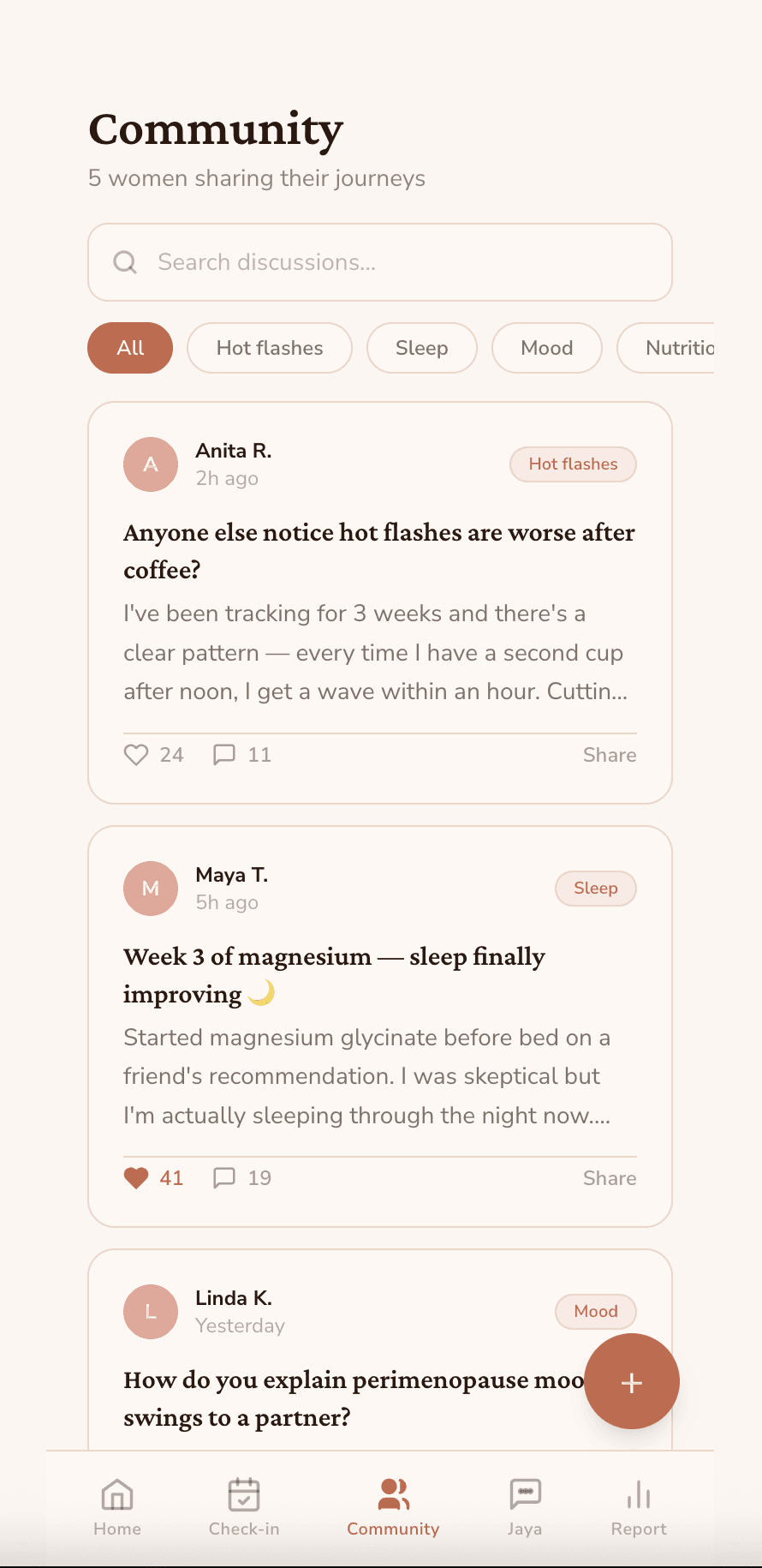
Community - Real stories, filtered by symptom. Priya had 7 hot flashes at work. Rekha fixed her night sweats with a fan. Sunita finally found a Mumbai gynaecologist who listened.


Jaya doctor finder — AI chat, 14-day symptom summary, doctor cards with consultation fees in rupees and languages spoken. Both are real barriers to Indian women actually seeing a specialist.

Doctor symptom report — 14 days of patient data, symptom frequency, trend chart, clinical observations. The thing a gynaecologist receives before an appointment and finally has real context.


Live at: unpause-life.vercel.app by the end of the night.

Onboarding — Name, stage, symptom chips. Personalises the entire app. The welcome screen reads "Welcome home, finally." I teared up writing that line.

Dashboard - Daily check-in, streak tracker, weekly symptom dots, AI-generated insights, education library, community preview.

Daily check-in - Mood, symptoms, intensity, notes. Designed to take 30 seconds, half-asleep, at 6am — which is statistically when menopause is most annoying.

Community - Real stories, filtered by symptom. Priya had 7 hot flashes at work. Rekha fixed her night sweats with a fan. Sunita finally found a Mumbai gynaecologist who listened.


Jaya doctor finder — AI chat, 14-day symptom summary, doctor cards with consultation fees in rupees and languages spoken. Both are real barriers to Indian women actually seeing a specialist.

Doctor symptom report — 14 days of patient data, symptom frequency, trend chart, clinical observations. The thing a gynaecologist receives before an appointment and finally has real context.


Live at: unpause-life.vercel.app by the end of the night.

What's next

The app is live but hasn't been user-tested at scale yet. Immediate next steps:

  • Real testing with 10–15 women aged 45–55 for a full feedback loop

  • UI refinement — the current build ships fast, not polished. Design system pass is next.

  • Clinical partnerships to validate the symptom-tracking data against real diagnostic patterns.

  • B2B pilot with 2–3 Indian gynaecology clinics using the doctor report

What building revealed that designing couldn't

Two things I didn't fully see until the app was live and not a Figma file.


One: screens are cheap in Figma, expensive in code. In Figma, adding a screen costs a few minutes. In code, every screen has to earn its place - it needs state, navigation, a reason to exist. The forcing function of code made me delete flows I'd been protecting in Figma for two years because they looked right on a slide. Shipping is a form of research. It tells you which of your design decisions were actually decisions and which were just habits.


Two: the doctor symptom report is the business model, not the consumer app. Consumer menopause apps monetize badly. Women in India don't pay ₹499/month for wellness. But gynaecologists have never had visibility into what their patients experience between appointments - and clinics will pay for a tool that gives them that context before consultations. The B2B product was hiding in a screen I'd built to serve the B2C user. I couldn't see it until it existed.


Neither of these was obvious in the Figma file. Both became obvious in the first 48 hours of the app being live.

What I actually learned

The research is the hard part. Understanding what a real person needs and why - that's the moat. The code is just the expression of the thinking. I had two years of the hard part done. What I was missing wasn't a co-founder or a dev agency or six months of sprints. It was the decision to start.


If you're a designer with research sitting in a Figma file: I see you. I was you for two years. The tools exist. The excuse doesn't.

What's next

The app is live but hasn't been user-tested at scale yet. Immediate next steps:

  • Real testing with 10–15 women aged 45–55 for a full feedback loop

  • UI refinement — the current build ships fast, not polished. Design system pass is next.

  • Clinical partnerships to validate the symptom-tracking data against real diagnostic patterns.

  • B2B pilot with 2–3 Indian gynaecology clinics using the doctor report

What I actually learned

The research is the hard part. Understanding what a real person needs and why - that's the moat. The code is just the expression of the thinking. I had two years of the hard part done. What I was missing wasn't a co-founder or a dev agency or six months of sprints. It was the decision to start.


If you're a designer with research sitting in a Figma file: I see you. I was you for two years. The tools exist. The excuse doesn't.

Create a free website with Framer, the website builder loved by startups, designers and agencies.