From scrolling to shopping

A three-week redesign of the Walmart Africa app homepage, argued through data and pushed through approval by three teams who didn't all agree.

Role & stack

UX Designer using Power BI, Figma, Vibey, AI

Timeline

3 weeks

Status

Approved

Home

/

Works

/

Walmart Africa

What this project was

and wasn't

My PM wanted to redesign the face of the Walmart Africa app. The intent was real. The problem was that "redesign the homepage" at a company like Walmart doesn't get funded on ambition - it gets funded on evidence, and only after PMs, engineering, and business teams have all signed off separately.


So before I opened Figma, I went looking for the case. Either the data would validate the vision, or it would kill it. What I didn't expect was that the data would make the case louder than either of us could.


Most of the work that got this to approval - synthesising Power BI exports, cross-referencing research, generating early homepage components in Vibey (Walmart's design system in VS Code) - happened before any traditional design file existed. Figma came in late, once the architecture had already been argued through.


Owned: Research synthesis, information architecture, wireframing, concept design, stakeholder documentation
With: 1 PM, UX research support from the South Africa team, product leads

The problem

49%

engaged.

6%

shopping.

The Walmart Africa homepage had a healthy engagement rate. Users were showing up, scrolling, tapping around. The problem was where the shopping actually happened - and it wasn't on the homepage.

49%

49%

HOMEPAGE ENGAGEMENT RATE

HOMEPAGE

ENGAGEMENT RATE

users showing up

6–7%

6–7%

HOMEPAGE → CART ADDITIONS

HOMEPAGE →

CART ADDITIONS

users actually shopping

40%

40%

SEARCH → CART ADDITIONS

SEARCH →

CART ADDITIONS

where action happens

13%

13%

PDP → CART ADDITIONS

PDP →

CART ADDITIONS

product pages

Users were showing up to the homepage and then going somewhere else to actually shop. The homepage was doing the first job of a homepage, pulling people in, and failing the second one.


"How do we make the homepage contribute more meaningfully to product discovery and cart creation?"

The evidence

High exposure did not equal high product action.

Some modules earned their placement.

Most were coasting on scroll depth.

High exposure did not equal high product action.

Some modules earned their placement.

Most were coasting on scroll depth.

Research & Competitive synthesis

Five design implications from the research.


1. Shoppers start with savings.

Deals, specials, and value cues aren't secondary they're the entry point. Price comparison happens on the homepage, sometimes while a user is standing inside a competitor's store.


2. Grocery shopping is repeat-heavy.

Buy Again, favourites, and reorder flows aren't features they're infrastructure. Users want to rebuild routine baskets, not rediscover products every session.

3. Relevance beats volume.

Curated, timely collections outperform generic category rows in both competitor apps and our research. Context beats taxonomy.

4. Speed is part of the value proposition.

Quick-commerce users want to get in and out. Long, banner-heavy homepages feel slower. Scroll depth is not engagement - it's friction dressed up as time-on-page.

5. Quality is an unclaimed position.

Checkers owns convenience. Pick n Pay owns value. Nobody in the SA market owns product quality. That's a gap Walmart Africa could claim and none of the design decisions below make sense without it.


One metric.

One question.

Search is at 40%. PDP is at 13%. The homepage is the first thing users see and the last thing contributing to the basket.


6–7% - current homepage → cart contribution.


This isn't about making search less important. It's about making the homepage stop being wasteful.


The hypothesis: A shorter, commerce-forward, repeat-friendly homepage - structured around deals, rebuy, and missions - will increase product clicks and downstream add-to-cart behaviour from the homepage surface.

Proposed architecture

Three zones. One rule: earn your spot.

Every module has to justify its placement through product clicks, ATC contribution, or repeat-purchase value. Impressions alone don't earn pixels — which sounds obvious, but the current homepage had four modules failing that test in the first three folds.

Zone 1 - Above the fold: does the hardest work.


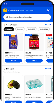
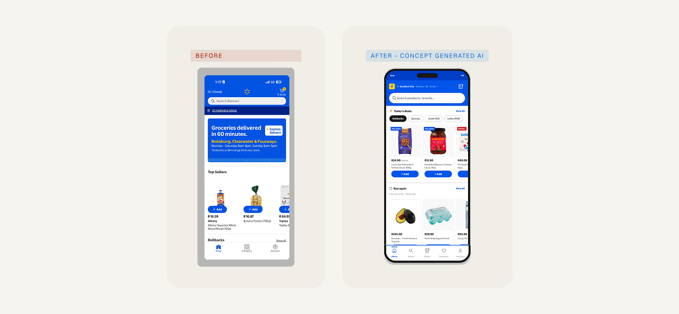
Location and delivery slot. Search bar (40% of cart additions). Deals, Rollbacks, and Specials (16.57% CTR).

Buy Again with one-tap reorder. Quick category shortcuts. Cart state indicator. Every module here has earned its position through measurable product action.

Zone 2 - Mid page: supports guided shopping.


Continue Shopping. Mission-based collections (Braai Weekend, Lunchbox Essentials). Top Sellers (971 clicks) as the anchor. Under R100 value basket. Personalised recommendations. Trending near you.

Zone 3 - Lower page: extended exploration only.


Departments, seasonal collections, brand promotions. Important for browse behaviour, deliberately pushed below the commerce-forward zones. This was one of the harder arguments - see below.

The shift: Departments help users browse. Missions help users decide. The homepage needs both, but missions come first.

Design decisions

From evidence to interface. Three specific decisions that came out of the data - and the arguments each one triggered.

01. Hero banner removal

Evidence:

The current hero banners showed 0.00% ATC contribution. The Liquor Adjustable Banner - one of the most prominent placements on the entire homepage - recorded a 0.12% click rate. Meanwhile, the Deals/Rollbacks cluster achieved 16.57% CTR without any hero treatment.

Decision:

Remove the generic hero banner from Zone 1. Replace with a tabbed deals module - Rollbacks, Specials, Under R50, Under R100 - with inline product cards and direct add-to-cart. No click-through required to add a product.

Measure:

Product CTR, ATC rate, and basket contribution versus the previous hero placement.

The pushback:

This was the decision that got the most resistance. Hero banners are the most visible ad inventory on the homepage, and removing them meant a real conversation with the business team about what to do with the promotional slots. The data won, eventually. The argument is still ongoing.

02. Buy Again prioritisation


Evidence:

SA grocery shopping is repeat-heavy. Buy Again was the highest-leverage ATC module when users found it — the problem was exposure, not performance. It sat below multiple generic carousels.

Decision:

Move Buy Again above the fold for returning users. Pair it with "Add all to cart" to collapse the reorder flow to one tap. New users see curated popular products in the same slot - no empty states.

Measure:

Buy Again usage as a percentage of returning sessions. Average items added per interaction.

03. Mission-based merchandising

Evidence:

The "Around the World" carousel — one of the only thematic collections on the current homepage — recorded the highest CTR at 1.15%. Thematic collections in competitor apps consistently outperformed static category browsing. SA shoppers respond to contextual framing more than taxonomic browsing.

Decision:

Introduce mission-based collections as the primary mid-page discovery mechanism. Departments move to Zone 3. Missions layer as the guided shopping path: Braai Weekend, Lunchbox Essentials, Dinner Tonight, Fresh for the Week.

Measure:

Mission CTR and ATC versus generic department rows in equivalent positions.

What happened, and

what would prove it right.

Approval on a project like this doesn't come from one meeting. It comes from three teams - product, engineering, and business - each signing off on their own terms. That took most of the three weeks. Product wanted evidence. Engineering wanted scope clarity. Business wanted to protect promotional real estate. The data was the only thing that survived all three conversations intact.


  • Homepage strategy and information architecture approved by product and research leads

  • Module prioritisation framework adopted - every module now needs to justify placement through measurable product action

  • Concepts moved into validation pipeline. Design direction incorporated into product roadmap.

  • Not yet launched. The impact is structural and strategic, not yet measured in production.


VALIDATION FRAMEWORK

Approval isn't the finish line. Some of the harder arguments - hero real estate, department demotion, banner reduction - are still live conversations. The data is on the design's side, but there's a difference between winning the argument and winning it permanently.

Approval isn't the finish line. Some of the harder arguments - hero real estate, department demotion, banner reduction - are still live conversations. The data is on the design's side, but there's a difference between winning the argument and winning it permanently.

This entire concept was

explored with AI

Three weeks from raw analytics to approved design concepts. Data synthesis, competitive research, JTBD analysis, usability review, stakeholder alignment all of it. That timeline wasn't possible before AI tools were part of the workflow.


But the timeline isn't the point. The point is what the timeline unlocked: enough evidence, framed clearly enough, that three teams with different priorities could all say yes.


AI accelerated the mechanical work - extracting patterns from Power BI exports, cross-referencing research documents, generating homepage components in Vibey without opening Figma, producing documentation at the pace of decisions.


Judgment did the work that mattered - deciding the 6–7% gap was a commerce problem and not a discovery problem, choosing the zone framework, arguing which modules earned their placement, holding the line in review cycles.

"AI accelerated the workflow. Product judgment determined what deserved to exist."

From scrolling to shopping

A three-week redesign of the Walmart Africa app homepage, argued through data and pushed through approval by three teams who didn't all agree.

Home

/

Works

/

Walmart Africa


Other works

View all works

Walmart Africa Returns · Mobile

Designing a post-purchase experience for a new market - from return initiation to pickup, tracking, and refund.

What this project was

and wasn't

My PM wanted to redesign the face of the Walmart Africa app. The intent was real. The problem was that "redesign the homepage" at a company like Walmart doesn't get funded on ambition - it gets funded on evidence, and only after PMs, engineering, and business teams have all signed off separately.


So before I opened Figma, I went looking for the case. Either the data would validate the vision, or it would kill it. What I didn't expect was that the data would make the case louder than either of us could.


Most of the work that got this to approval - synthesising Power BI exports, cross-referencing research, generating early homepage components in Vibey (Walmart's design system in VS Code) - happened before any traditional design file existed. Figma came in late, once the architecture had already been argued through.


Owned: Research synthesis, information architecture, wireframing, concept design, stakeholder documentation
With: 1 PM, UX research support from the South Africa team, product leads

The problem

49%

engaged.

6%

shopping.

The Walmart Africa homepage had a healthy engagement rate. Users were showing up, scrolling, tapping around. The problem was where the shopping actually happened - and it wasn't on the homepage.

Users were showing up to the homepage and then going somewhere else to actually shop. The homepage was doing the first job of a homepage, pulling people in, and failing the second one.


49%

HOMEPAGE ENGAGEMENT RATE

users showing up

6–7%

HOMEPAGE → CART ADDITIONS

users actually shopping

40%

SEARCH → CART ADDITIONS

where action happens

13%

PDP → CART ADDITIONS

product pages

"How do we make the homepage contribute more meaningfully to product discovery and cart creation?"

The evidence

High exposure did not equal high product action.

Some modules earned their placement.

Most were coasting on scroll depth.

Research & Competitive synthesis

Five design implications from the research.


1. Shoppers start with savings.

Deals, specials, and value cues aren't secondary they're the entry point. Price comparison happens on the homepage, sometimes while a user is standing inside a competitor's store.


2. Grocery shopping is repeat-heavy.

Buy Again, favourites, and reorder flows aren't features they're infrastructure. Users want to rebuild routine baskets, not rediscover products every session.

3. Relevance beats volume.

Curated, timely collections outperform generic category rows in both competitor apps and our research. Context beats taxonomy.

4. Speed is part of the value proposition.

Quick-commerce users want to get in and out. Long, banner-heavy homepages feel slower. Scroll depth is not engagement - it's friction dressed up as time-on-page.

5. Quality is an unclaimed position.

Checkers owns convenience. Pick n Pay owns value. Nobody in the SA market owns product quality. That's a gap Walmart Africa could claim and none of the design decisions below make sense without it.


One metric.

One question.

Search is at 40%. PDP is at 13%. The homepage is the first thing users see and the last thing contributing to the basket.


6–7% - current homepage → cart contribution.


This isn't about making search less important. It's about making the homepage stop being wasteful.


The hypothesis: A shorter, commerce-forward, repeat-friendly homepage - structured around deals, rebuy, and missions - will increase product clicks and downstream add-to-cart behaviour from the homepage surface.

Proposed Architecture

Three zones. One rule: earn your spot.

Every module has to justify its placement through product clicks, ATC contribution, or repeat-purchase value. Impressions alone don't earn pixels — which sounds obvious, but the current homepage had four modules failing that test in the first three folds.

Zone 1 - Above the fold: does the hardest work.


Location and delivery slot. Search bar (40% of cart additions). Deals, Rollbacks, and Specials (16.57% CTR).

Buy Again with one-tap reorder. Quick category shortcuts. Cart state indicator. Every module here has earned its position through measurable product action.

Zone 2 - Mid page: supports guided shopping.


Continue Shopping. Mission-based collections (Braai Weekend, Lunchbox Essentials). Top Sellers (971 clicks) as the anchor. Under R100 value basket. Personalised recommendations. Trending near you.

Zone 3 - Lower page: extended exploration only.


Departments, seasonal collections, brand promotions. Important for browse behaviour, deliberately pushed below the commerce-forward zones. This was one of the harder arguments - see below.

Design decisions

Three zones. One rule: earn your spot.

Every module has to justify its placement through product clicks, ATC contribution, or repeat-purchase value. Impressions alone don't earn pixels — which sounds obvious, but the current homepage had four modules failing that test in the first three folds.

01. Hero banner removal

Evidence:

The current hero banners showed 0.00% ATC contribution. The Liquor Adjustable Banner - one of the most prominent placements on the entire homepage - recorded a 0.12% click rate. Meanwhile, the Deals/Rollbacks cluster achieved 16.57% CTR without any hero treatment.

Decision:

Remove the generic hero banner from Zone 1. Replace with a tabbed deals module - Rollbacks, Specials, Under R50, Under R100 - with inline product cards and direct add-to-cart. No click-through required to add a product.

Measure:

Product CTR, ATC rate, and basket contribution versus the previous hero placement.

The pushback:

This was the decision that got the most resistance. Hero banners are the most visible ad inventory on the homepage, and removing them meant a real conversation with the business team about what to do with the promotional slots. The data won, eventually. The argument is still ongoing.

02. Buy Again prioritisation


Evidence:

SA grocery shopping is repeat-heavy. Buy Again was the highest-leverage ATC module when users found it — the problem was exposure, not performance. It sat below multiple generic carousels.

Decision:

Move Buy Again above the fold for returning users. Pair it with "Add all to cart" to collapse the reorder flow to one tap. New users see curated popular products in the same slot - no empty states.

Measure:

Buy Again usage as a percentage of returning sessions. Average items added per interaction.

03. Mission-based merchandising

Evidence:

The "Around the World" carousel — one of the only thematic collections on the current homepage — recorded the highest CTR at 1.15%. Thematic collections in competitor apps consistently outperformed static category browsing. SA shoppers respond to contextual framing more than taxonomic browsing.

Decision:

Introduce mission-based collections as the primary mid-page discovery mechanism. Departments move to Zone 3. Missions layer as the guided shopping path: Braai Weekend, Lunchbox Essentials, Dinner Tonight, Fresh for the Week.

Measure:

Mission CTR and ATC versus generic department rows in equivalent positions.

What happened, and

what would prove it right.

Approval on a project like this doesn't come from one meeting. It comes from three teams - product, engineering, and business - each signing off on their own terms. That took most of the three weeks. Product wanted evidence. Engineering wanted scope clarity. Business wanted to protect promotional real estate. The data was the only thing that survived all three conversations intact.


  • Homepage strategy and information architecture approved by product and research leads

  • Module prioritisation framework adopted - every module now needs to justify placement through measurable product action

  • Concepts moved into validation pipeline. Design direction incorporated into product roadmap.

  • Not yet launched. The impact is structural and strategic, not yet measured in production.


VALIDATION FRAMEWORK

Approval isn't the finish line. Some of the harder arguments - hero real estate, department demotion, banner reduction - are still live conversations. The data is on the design's side, but there's a difference between winning the argument and winning it permanently.

This entire concept was

explored with AI

Three weeks from raw analytics to approved design concepts. Data synthesis, competitive research, JTBD analysis, usability review, stakeholder alignment all of it. That timeline wasn't possible before AI tools were part of the workflow.


But the timeline isn't the point. The point is what the timeline unlocked: enough evidence, framed clearly enough, that three teams with different priorities could all say yes.


AI accelerated the mechanical work - extracting patterns from Power BI exports, cross-referencing research documents, generating homepage components in Vibey without opening Figma, producing documentation at the pace of decisions.


Judgment did the work that mattered - deciding the 6–7% gap was a commerce problem and not a discovery problem, choosing the zone framework, arguing which modules earned their placement, holding the line in review cycles.

"AI accelerated the workflow. Product judgment determined what deserved to exist."

Create a free website with Framer, the website builder loved by startups, designers and agencies.